Best Farmhouse Paint Colors
I have been hard at work on an exciting new project that has had me taking an extraordinary number of pictures of my home this week. As I was editing some of these photos, I realized that there is a color story that runs through my entire house that becomes quite evident when you see the rooms portrayed together.
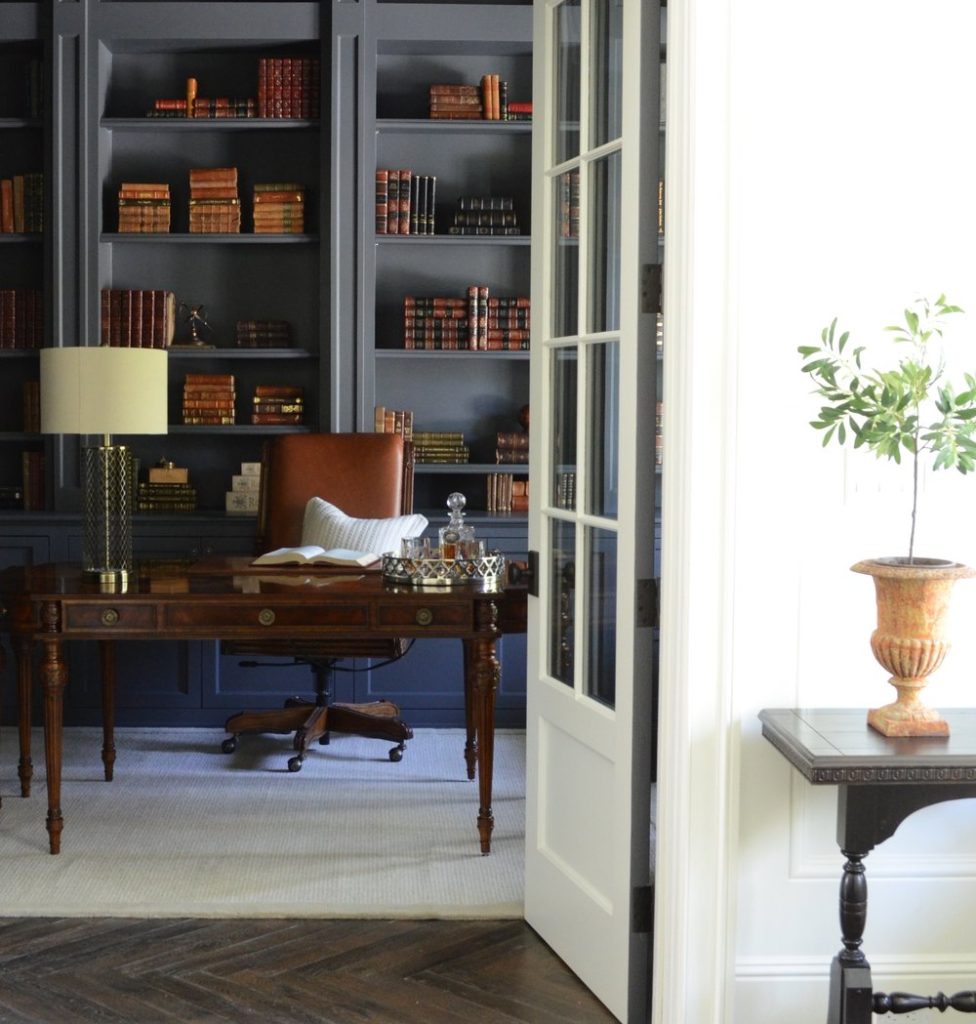
Restoration Hardware – Flint on the library cabinets and walls
So I thought I would share with you the process I went through to chose these colors, and how using a limited color palette can create a cohesive look throughout your home.
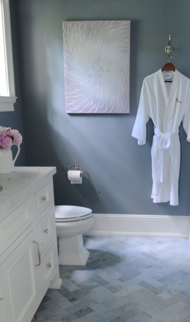
RTo backtrack for just a minute, when we built our home a couple of years ago, I chose classic finishes like white marble, dark charcoal stone, neutral floors with a hint of gray and some touches of blue in the bathrooms. I liked this range of colors in my hard surfaces, because it left many possibilities when choosing paint colors for the walls and cabinets.
My strategy in deciding on paint colors was a simple one…keep it all in the same tones and limit the number of colors.
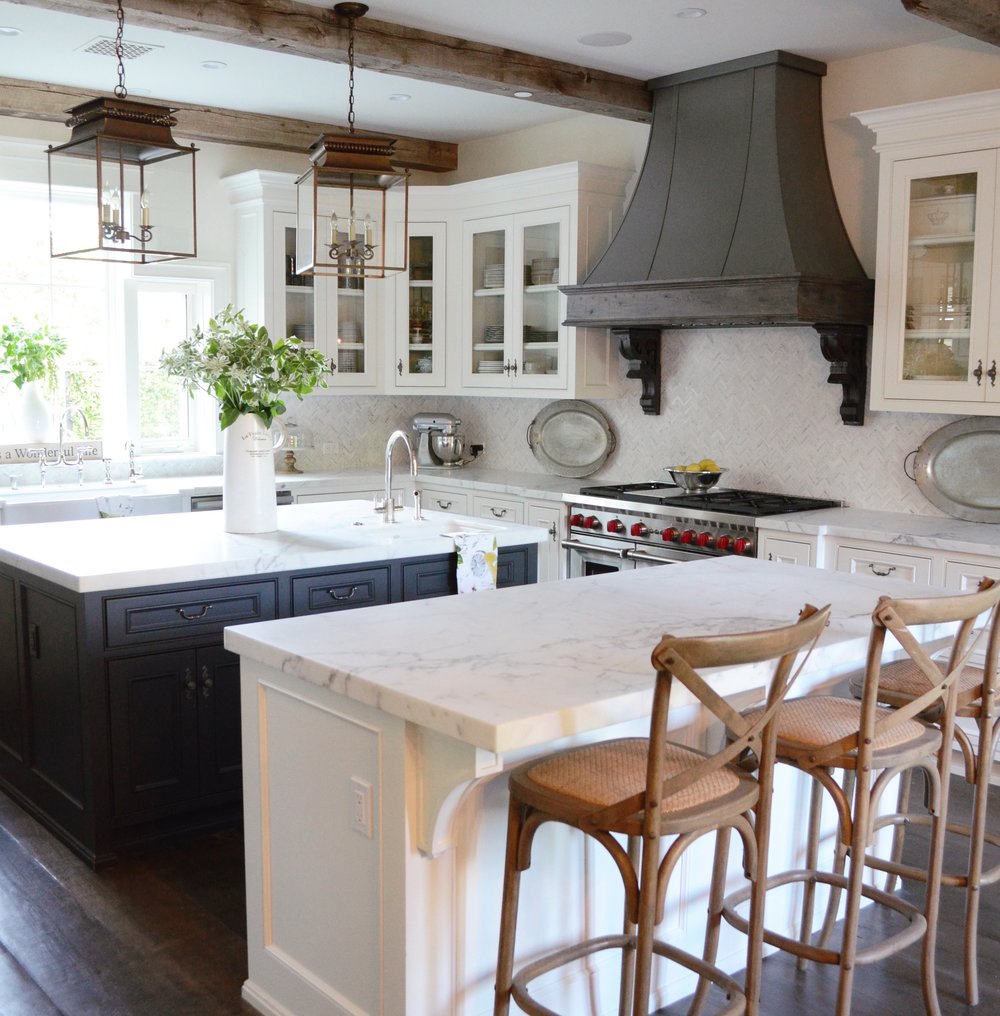
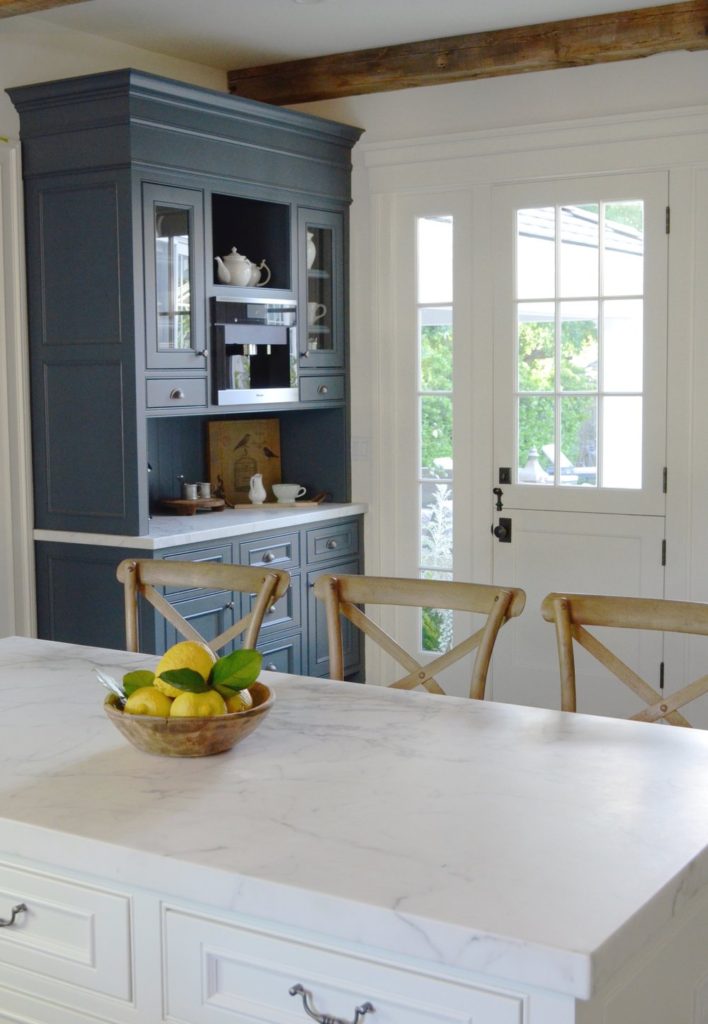
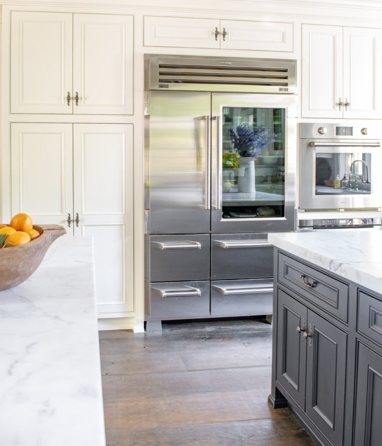
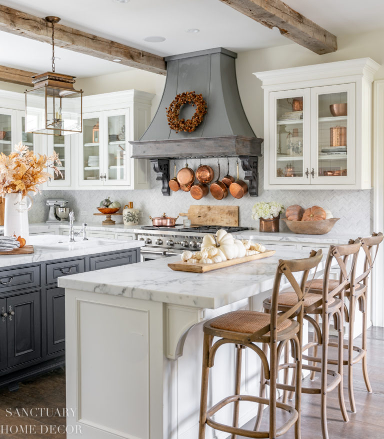
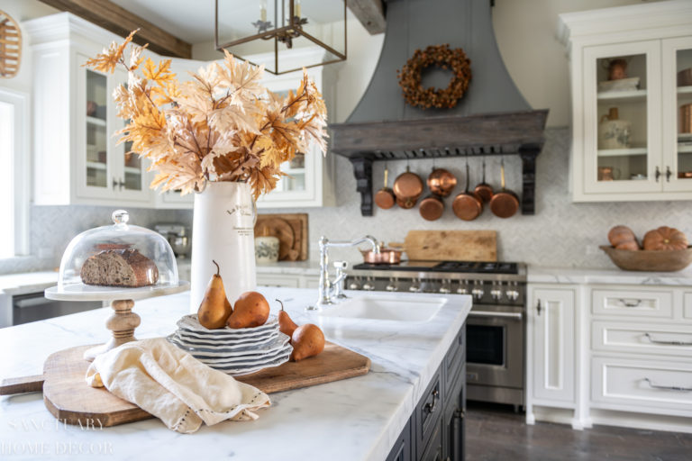
So with that in mind we decided on Benjamin Moore – Swiss Coffee for nearly all of the walls and kitchen cabinets. This is a creamy white and was exactly what I was looking for in our home. Nothing too stark or bright, just a soft, clean backdrop.
Aside from that, I also chose only five additional colors to use on specific walls and cabinets throughout the house as accent colors.


As we walked through each room I carried the sample boards my painter had prepared of the colors we were using. I then decided if there was a wall or cabinet where I could add one of the five colors.
These sample boards were invaluable, because they allowed me to see the colors in different lighting conditions and on different walls.
The process became quite simple, and we did not vary from this palette, specifically because I wanted to keep a uniform look and feel throughout the house.
In the past, I have veered off this concept and used a “new” color in a completely different palette for a room or cabinet, and I am always sorry I did. The thing is, no matter how much I may love a color in a particular room, when it is a stark contrast to the rest of the house, the space always feels oddly disconnected to me.
So this time, rather than taking a room by room approach when it came to paint, I took a whole house approach.
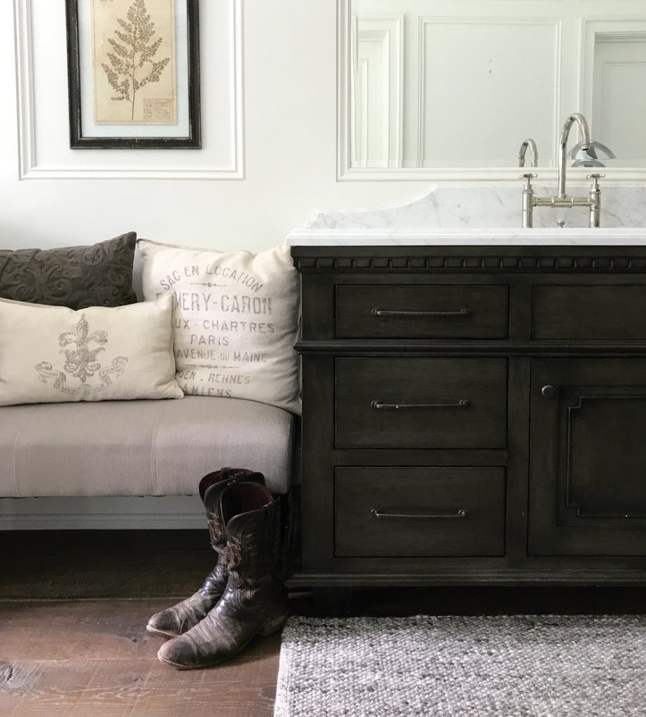
Because I had used a neutral and consistent palette for all of my hard finishes, it was not difficult to remain consistent in my paint choices. Even in areas where I had added a blue accent, there was a paint color that worked for the walls or cabinet.
Just last month we finally decided to paint the walls in the dining room. Rather than start a new search for a paint color, I chose from our original palette and am so happy I did. There were no surprises or issues of tone, just a fresh look that feels like it fits right in to the rest of the house.
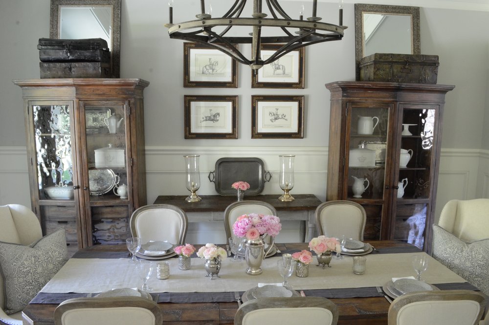
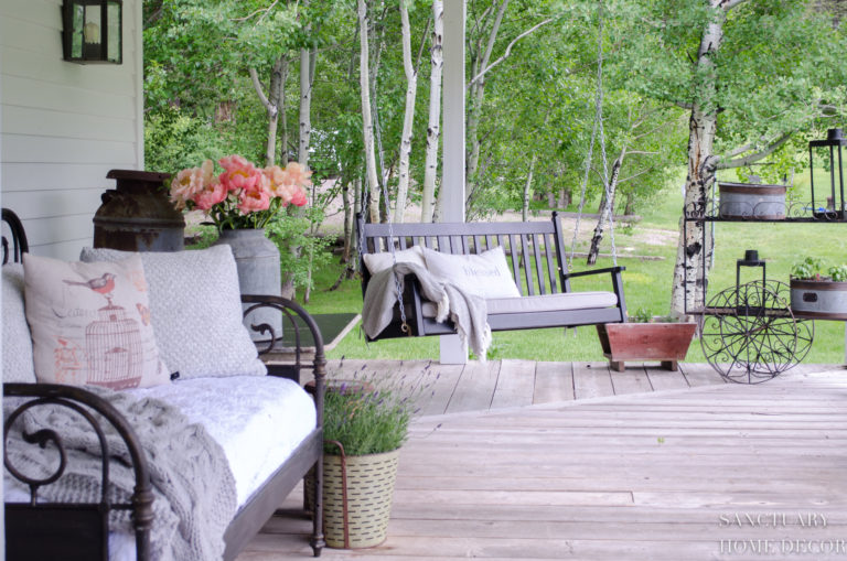
The final layer of color in our home came from the furniture and rugs. Again, I took a whole house approach to adding new pieces of furniture and looked for pieces that matched the overall color scheme rather than focusing on a room at a time.
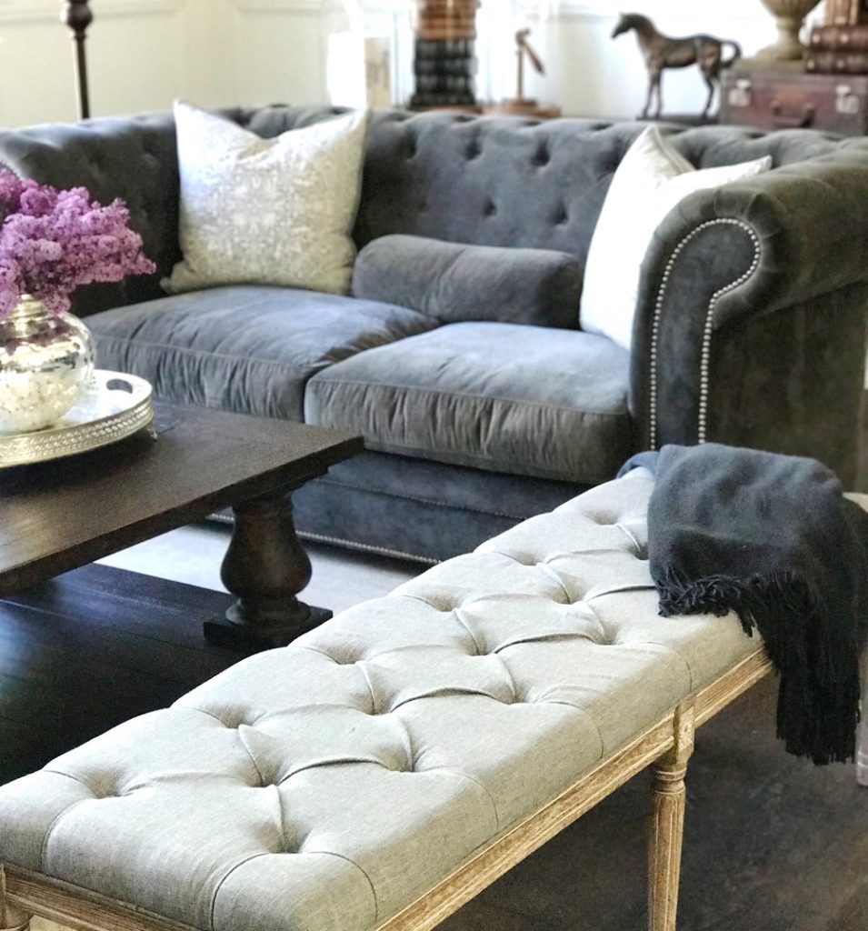
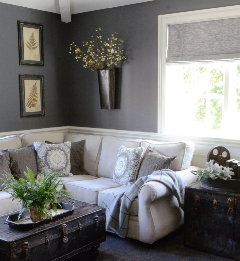
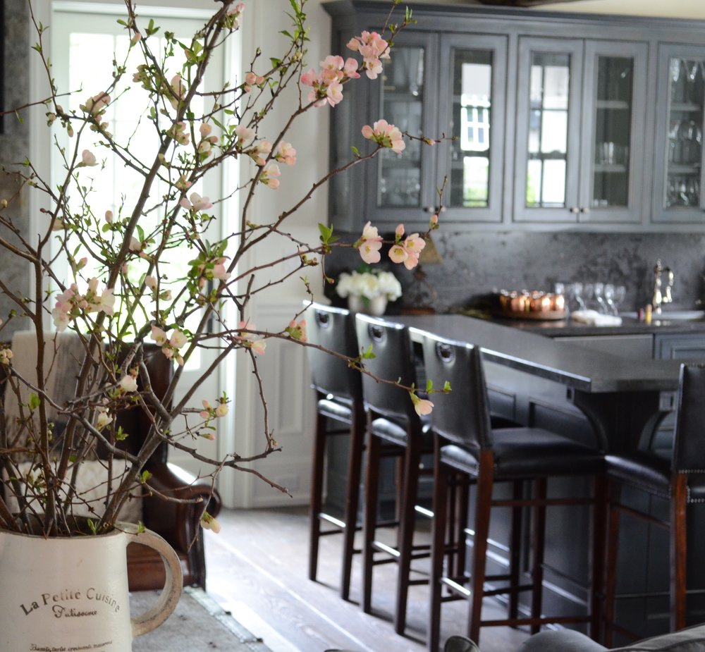
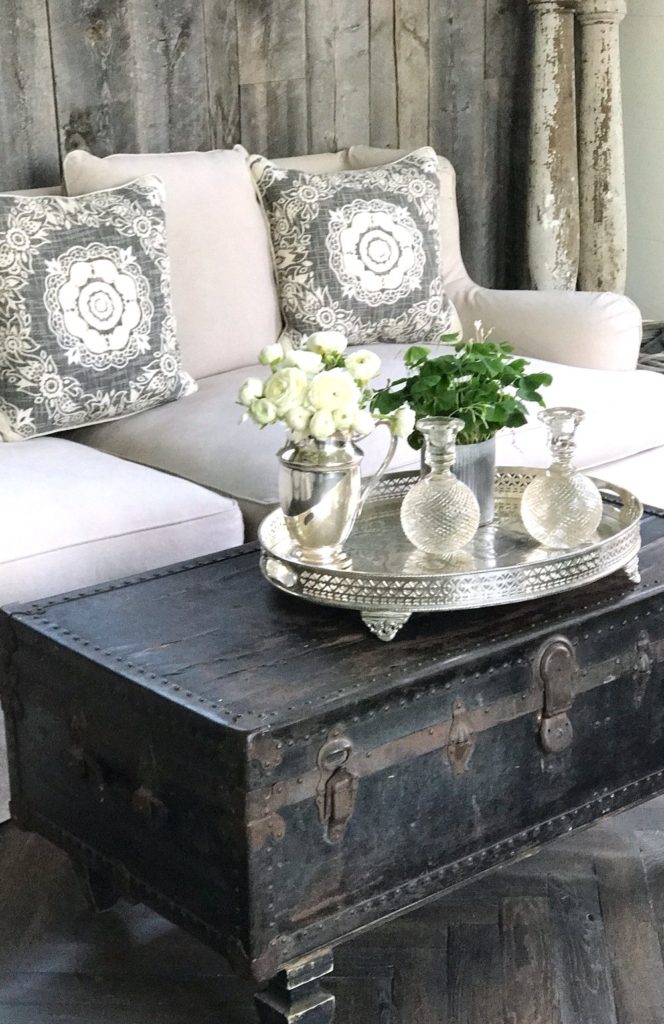
I chose dark and light grays, slate blues and warm browns as my basic colors. I lightened all of these rich colors with soft linen tones and creamy white accents.
The great thing about this is I can move furniture from room to room in my house and everything works together. There is no piece that feels disconnected or out of place.
I have also been known to paint furniture that I love, a new tone, to fit into our current color scheme. If there is a piece I love…I will find a way to make it work!
So there’s my color story…I know that choosing paint colors can be really stressful and frustrating, so if you are embarking on a large home project or simply redesigning a room, my advice is to get color samples you can move around the room, try to stay with a cohesive palette throughout your home and most of all have fun creating YOUR color story!

I so thoroughly enjoy your blog – so beautiful and inspirational. I am redoing the wall colors and woodwork in my home. The advice in this article was most helpful. What color do you use on the workbook in your home?
Thank you so much Cindy! That means a lot to me!
I love your style! Did you use Swiss Coffee for all the woodwork/trim? And is it semi gloss?
Hi Diane! Sorry for the delayed response! Yes we used Swiss Coffee for everything and it is in eggshell finish. Hope that helps : )
May I ask who the chesterfield sofa is by? It all looks great!
Hi Justin-The sofa is originally from Dovetail Furniture, but I don’t think it’s available any longer. Wish I could be more help!
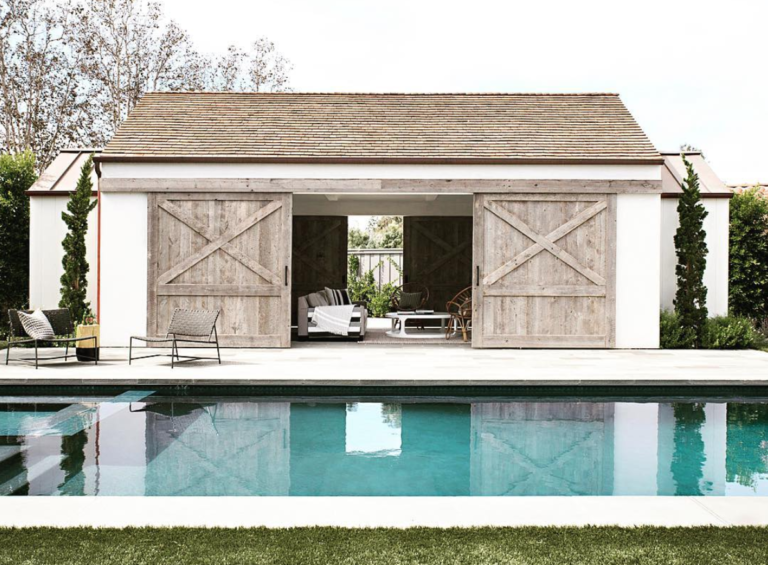
I love your home and especially love the color of the California house. What color is on the exterior? Thank you.
Can you please tell me the color and make of the velvet sofa?
It is made by Dovetail Furniture but I don’t think they still make it…Sorry.
Thank you so much for detailing your color choices and thought process behind them. Everything you have done inside and outside of your home is perfection. What are the exterior paint colors used?
What is the stain color of your corbels & hood trim?